Prime
The magic of getting perfect curtain colour combinations
This combination exudes a refined and peaceful elegance that elevates any interior. PHOTO/UNSPALSH.COM.
What you need to know:
- The right curtain colour combinations can profoundly impact the aesthetics and mood of a room.
- They are also a reflection of your personality and set the tone for your entire living space.
Combining colours for curtains can significantly enhance a room’s aesthetics by adding depth and visual interest. By thoughtfully pairing colours, you can create a dynamic and engaging look that complements other design elements in the space. This approach not only sets the mood, whether cosy with warm tones or calming with cool hues, but also allows for customization and personalization to fit your style. Colour combinations can highlight curtains as focal points, frame views, and balance out strong design elements, ensuring a harmonious flow throughout the room. Here are some of the most popular colour combinations for curtains.
Charcoal grey and mint green
Charcoal grey and mint green make an ideal curtain colour combination because they strike a perfect balance between sophistication and freshness. Charcoal grey offers a rich, neutral backdrop that grounds the space with its elegant, modern appeal, while mint green injects a soothing, invigorating touch of colour that lightens the overall aesthetic.
The cool, muted tones of mint green complement the deep, versatile grey, making the combination suitable for various interior styles—from contemporary to classic. Together, these colours enhance the room’s ambience, offering both a calming effect and a refined, stylish look.
Soft pink and silver
These two make the perfect curtain colour combination by seamlessly blending a gentle, romantic hue with a sophisticated, metallic touch. Soft pink introduces a warm, delicate tone that adds a sense of comfort and tranquility to the space, while silver injects a modern, glamorous flair that reflects light and enhances the room’s elegance.


The subtle contrast between these colours creates a balanced and refined look, making the combination ideal for a variety of styles, from contemporary chic to classic charm. This pairing not only elevates the visual appeal of the curtains but also adds a touch of luxury and serenity to the overall décor.
Burnt orange and navy blue
Burnt orange and navy blue make an exceptional curtain colour combination by striking a vibrant yet sophisticated balance. Burnt orange brings a warm, energising glow that infuses the room with a dynamic, welcoming feel. In contrast, navy blue offers a deep, calming anchor that grounds the space with its rich, classic elegance. Together, these colours create a visually compelling contrast that adds depth and interest without clashing.
The warmth of burnt orange complements the coolness of navy blue, resulting in a harmonious blend that enhances both modern and traditional interiors. This combination not only adds a touch of drama and sophistication but also creates a cosy, inviting atmosphere that transforms any room.
Lavender and Ivory
Lavender and ivory have a softness and elegance that enhances any room’s atmosphere. Lavender introduces a delicate, soothing hue with its subtle mix of purple and blue tones, adding a touch of tranquility and gentle sophistication. Ivory, with its creamy and neutral quality, provides a warm, light backdrop that complements and softens the lavender, creating a serene and balanced look.
This pairing ensures a harmonious contrast that feels both fresh and timeless, making it ideal for a variety of settings from romantic and classic to modern and understated.

This is ideal for spaces where you want to create an atmosphere of warmth and positivity.
Crisp white and bold emerald green
If what you are looking for is freshness and vibrancy, look no further than this combination. Crisp white offers a clean, neutral backdrop that brightens the space and provides a timeless elegance. In contrast, bold emerald green introduces a rich, invigorating pop of colour that adds depth and sophistication. The dynamic contrast between the two colours creates a striking visual effect without overwhelming the room.
This combination enhances the overall aesthetic by combining the purity and clarity of white with the luxurious and energetic quality of emerald green, making it an ideal choice for both contemporary and classic interiors. Together, they bring a sense of vitality and refinement to any space.
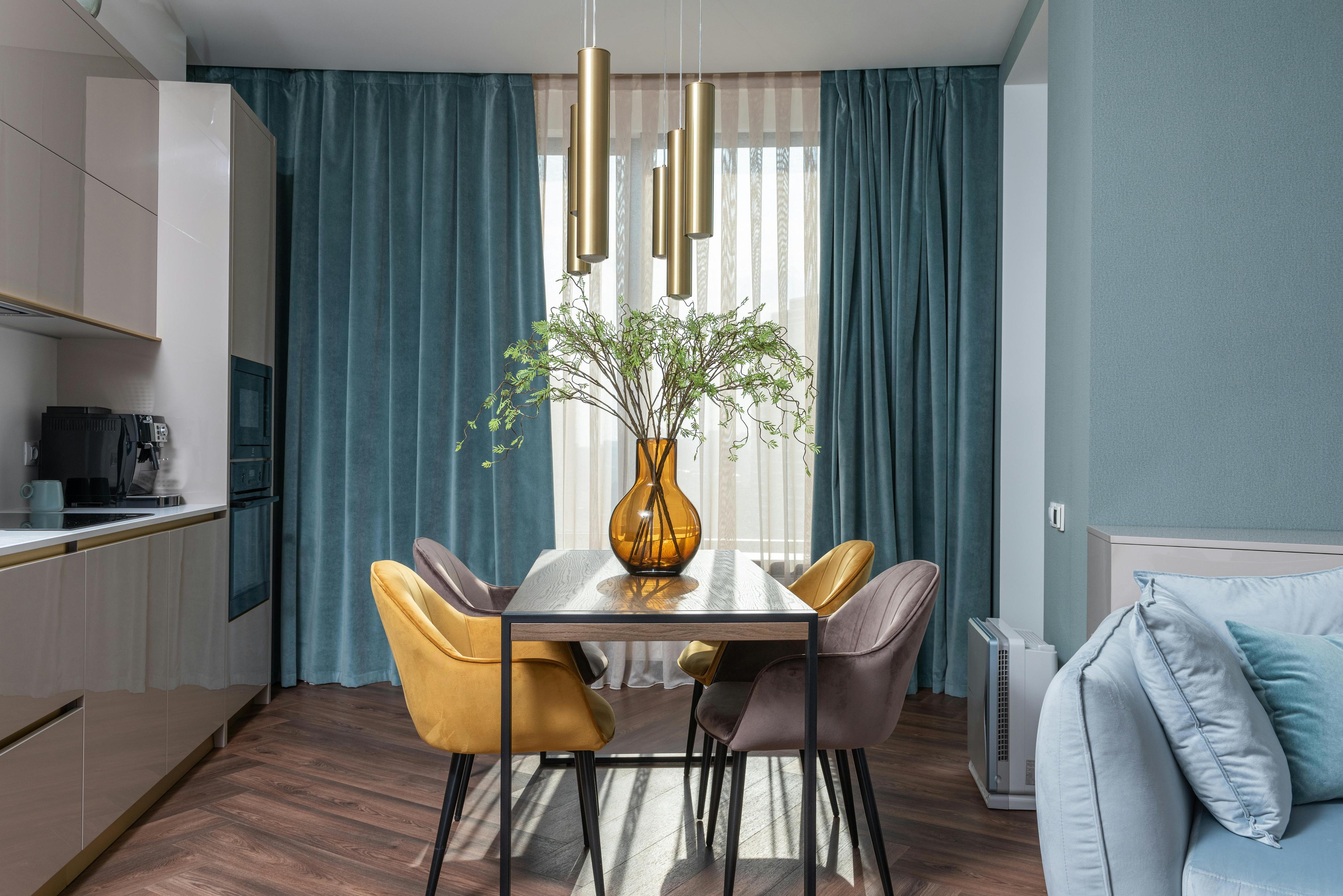
Classic white and pastel plue
These two create the perfect curtain colour combination by seamlessly blending timeless elegance with serene, calming tones. Classic white provides a clean, versatile backdrop that brightens and opens up the space, offering a sophisticated and neutral foundation. Pastel blue introduces a soft, gentle hue that adds a touch of tranquility and freshness, enhancing the room’s atmosphere with its soothing quality.
This pairing achieves a balanced and harmonious look, where the purity of white complements the subtle charm of pastel blue, creating a serene and inviting ambiance. Ideal for a range of styles from modern to traditional, this combination exudes a refined and peaceful elegance that elevates any interior.
Bold black and vibrant red
Bold black and vibrant red offer a striking contrast that is both dramatic and energising. Black serves as a strong, grounding colour that adds depth and sophistication to the space, providing a dramatic backdrop that enhances other design elements. Vibrant red, on the other hand, injects a powerful burst of energy and passion, creating a dynamic focal point that draws attention and adds a lively pop of colour.
The juxtaposition of these two bold hues creates a visually captivating effect that exudes confidence and modernity. This combination is ideal for spaces where you want to make a bold statement, infusing the room with a sense of drama and excitement while maintaining a sense of refined elegance.
Earthy green andsoft beige
Earthy green and soft beige blend natural warmth with understated elegance. Earthy green brings a grounded, organic feel to the room, evoking a sense of calm and connection with nature. Its rich, muted tone provides depth and tranquility. Soft beige complements this with its gentle, neutral quality, offering a warm, versatile backdrop that enhances the green without overpowering it. This combination is ideal for creating a serene, cosy environment that exudes both comfort and sophistication, making it perfect for a wide range of interior styles from rustic to modern.
Chocolate Brown and Teal
The rich, earthy tones of chocolate brown provide a solid, grounding presence, adding depth and sophistication to the space. In contrast, teal offers a pop of refreshing colour with its blend of blue and green, which introduces a lively yet soothing touch. This dynamic pairing creates a visually appealing contrast that enhances the room’s aesthetic without overwhelming it. It is versatile enough to complement various interior styles, from modern to traditional, making it an ideal choice for adding both warmth and sophistication.